Tuesday, August 4, 2015

All sky map of exoplanet host stars: Multi-planet systems (exoplanet.eu)


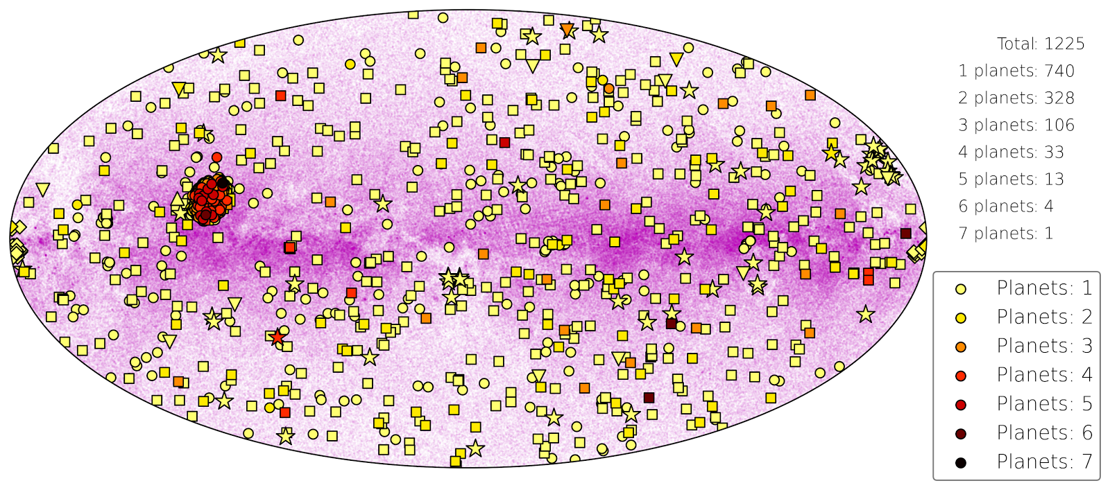
With this post I continue my series on exoplanet host star all sky maps. What you see is basically the same thing I showed two posts ago. This time, however, I choose the color to represent the number of exoplanets in the system. So the symbol tells you which method was used to detect the system and the color tells you how many planets are know right now in this system (August 3, 2015, exoplanet.eu). The 740 lightyellow-colored host stars have only one planet, the one black circle in the Kepler field of view (Kepler-90 alias KOI-351) is the only exoplanet system with seven planets - all transiting the host star.

The Kepler field of view is so crowded that I include a zoom in on this region; it's the figure on the left side. The only seven planet system is on the top right of the Kepler FOV whereas the only transiting six planet system (Kepler-11) is pretty much at the bottom. In the all sky map you can see three other six planet systems, however, these where detected with the RV method.

Monday, August 3, 2015

Exoplanet host stars: The Kepler field of view (exoplanet.eu)


This is an addition to the post before. The plot shows the Kepler field of view in detail, all symbols and colors stay the same. This is the region in the sky from which we - by far - know the most planets around stars. Until July 23, 2015, Kepler has discovered 1879 confirmed exoplanets around 471 stars (according to exoplanetarchive.ipac.caltech.edu).

Sunday, August 2, 2015

All sky map of exoplanet host stars (exoplanet.eu)


Today I'd like to show something not directly connected to the last couple of posts. This is an all sky map of exoplanet host stars. Different colors/symbols indicate the method used to detect the planet. The data was taken from exoplanet.eu. Actually, I tried to plot all planetary systems know today, which according to exoplanet.eu should be 1228, but for some reason I am missing three in the transit method.

The underlying magenta colored points are about one million stars from the Tycho catalog (ESA Hipparcos satellite). The map is an aitoff projection of the sky in galactic coordinates and the Milky Way lies at the equator; this is why most of the stars are located there.

Most of the planets are detected with the transit method. However, the majority is located in the small area crowded with black dots - the Kepler field of view. When we talk about statistics of transiting exoplanets we are actually talking about a small part in the sky and not the entire sky. Astrophysicists just assume that it should be the same everywhere. The other black dots come from different surveys, e.g., CoRoT or WASP.

The picture is different when looking at planets detected with the radial velocity (RV) method. They seem to be more uniformly distributed. It's the second most successful technique with 454 stars having planets around them.

At least according to exoplanet.eu, so far there is only one astrometry planet and it is very close to the Kepler FOV - although it's not in it. The star is HD 176051 b. So far it seems to be too difficult to detect planets with this method, but it is expected that with GAIA there will be many planets coming from this technique.

Imaging seems pretty much located to certain areas, avoiding the plane of the Milky Way as much as possible. This is probably a good idea since background stars that coincidentally stand close to the potential host stars make it more difficult to find planets - or might even be misinterpreted as bodies belonging to the system.

All microlensing planets come from a limited area in the direction of the center of the Milky Way, which in this map is at the edge. This illustrates nicely that microlensing really samples a quite different population of stars. All other techniques try to go away from the galactic center (and even the galactic plane) and only find exoplanets rather close to the Sun. The most distant microlensing planet, however, is about 25000 light years away - virtually in the center of the Milky Way.

The transit timing variation (TTV) planets are all in the Kepler FOV. For this method one needs good light curves and a long cadence to cover many transits, and this is what Kepler does best. According to exoplanet.eu there are only four TTV planets - which I do not think is true; there have to be much more. exoplanets.org says it's more like 60 (including some pulsar planets), which I believe is closer to the real number.

Finally, we have the planets around pulsars. There are a few in the Kepler FOV, but otherwise I do not really see a system there. I think it is nice to notice that PSR 1257 12 b is the star with the first exoplanet detection in the year 1992 - and it actually is a three-planet system! I think is has to be one of the two triangles in the upper right. Usually, people cite 51 Peg b as the first exoplanet - it was the first around a solar-type star. I guess pulsars are just too different ...


Thursday, July 30, 2015

Transits: Limb darkening - HD 209458 b in different colors (HST)

In the previous post I presented theoretical transits of how the exoplanet HD 209458 b should look like in different colors. Now I will show how its transits really look like.

On the left you see observations of the Hubble Space Teleskope (HST) from 320 to 970 nm. The last transit, which is much nosier, is not from HST but Spitzer - a NASA space misson for infrared observations.

Actually, HST observed many spectra of the star covering a full transit. By averaging over different parts of the spectrum you get the transit in a certain color. The central wavelength of the interval over which was averaged is given on the right side of each transit. The colors range from the ultraviolet to the near-infrared.

The Spitzer data is special because it lies at a much higher wavelength in the far-infrared. There the star should have virtually no limb darkening anymore and the transit has a box shape. However, you cannot see that very well because it is much more difficult to get precise brightness measurements for these wavelengths. The star is much fainter there and, thus, the noise is much higher. Also the two instruments are pretty different which leads to non-equal measurement errors.

In the last post I showed what we should expect from theory - and the observations agree nicely with it. In UV and blue the shape of the transit is much rounder than for longer wavelength. Indeed, limb darkening is stronger for shorter wavelengths.

It is actually pretty hard to measure the limb darkening of stars; they are just too far away to spatially resolve them. Analyzing exoplanetary transits is one of the best methods to verify whether the theoretical predictions are really correct. And so far the models seem to work pretty well - although in detail observations and theory are not so easy to compare. After all, the exact shape of the transit depends on a lot of different things.

Wednesday, July 29, 2015

Transits: Limb darkening in theory

Now let us take a look at limb darkening in transits. In the beginning I will start with theoretical transits - transit lightcurves generated on the computer. This makes explanations a bit easier, we will come to real data soon enough.

For demonstration purposes I chose one of the best known exoplanets today: HD 209458 b. In 1999 this was the first transiting planet ever observed (Charbonneau 2000), a true milestone in the history of astrophysics. It is a huge planet, about 1.3 times the radius of Jupiter but only 70 % of its mass. It is a good planet to start with because its large size results in a deep transit.

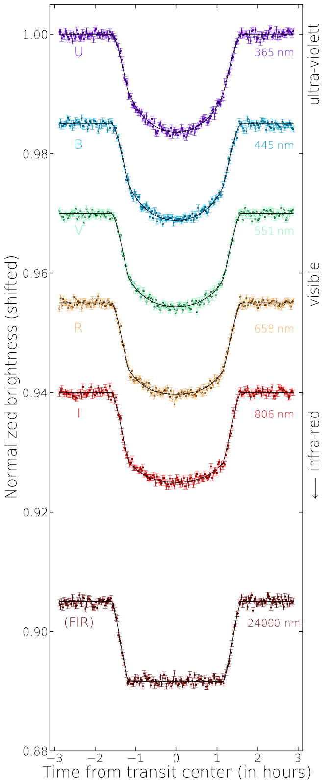
The figure on the left side shows simulated transits of HD 209458 b for different wavelengths. This is interesting because the limb darkening of the star depends on the color you are looking at. So in different colors the transit shape will be different. I added a bit of noise to the lightcurve to make it look more like a real observation. The noise is roughly consistent with the uncertainty of the Hubble Space Telescope data of this planet I will show in the next post.

All transits are normalized meaning that the (average) brightness outside of the transit is one. However, if I plot them all over each other we would not see them very well anymore; so transits observed at longer wavelengths are shifted downwards. The corresponding wavelength (in nm) is given on the right side of each transit lightcurve. On the very right it is indicated to which wavelength regime (UV, visible, IR) this wavelength belongs. Keep in mind that visible light goes from 380 to 750 nm.

The x-axis shows you the time of the observation of each data point in hours from transit center; the transit duration of HD 209458 b is about three hours.

What can we learn from this figure? Due to the limb darkening the transit shape is round for blue colors (shorter wavelengths) and gets more box-shaped for red colors (longer wavelengths). When going further into the infrared, the transit looses its round shape completely because there is (almost) no limb darkening of the stellar disk anymore. In real data this would be nice because dealing with limb darkening can be a nuisance; you just have to deal with a few parameters less you do not really know for sure. However, it is not that easy to obtain high-quality transit lightcurves in the infrared - even for the best instruments scientist have right now. This is what I will show you in the next post.


Addendum: A more technical note at the end. On the left side of the transits in the figure letters are written: U, B, V, R, I (and FIR). These letters indicate the photometric bands (Johnson filters) used to simulate the transit lightcurves which are important to know the theoretically expected limb darkening. If you know your star and the photometric filter, you can calculate how the limb darkening should be. Here I use the non-parametric limb darkening coefficients for the Johnson filters for a Sun-like star published in this paper.
FIR is not a real filter; it stands for far-infrared. I just assumed at this long wavelength the limb darkening is zero. This way we have a comparison how the transit would look like if there is no limb darkening at all.

Limb darkening: SDO 17.1 nm


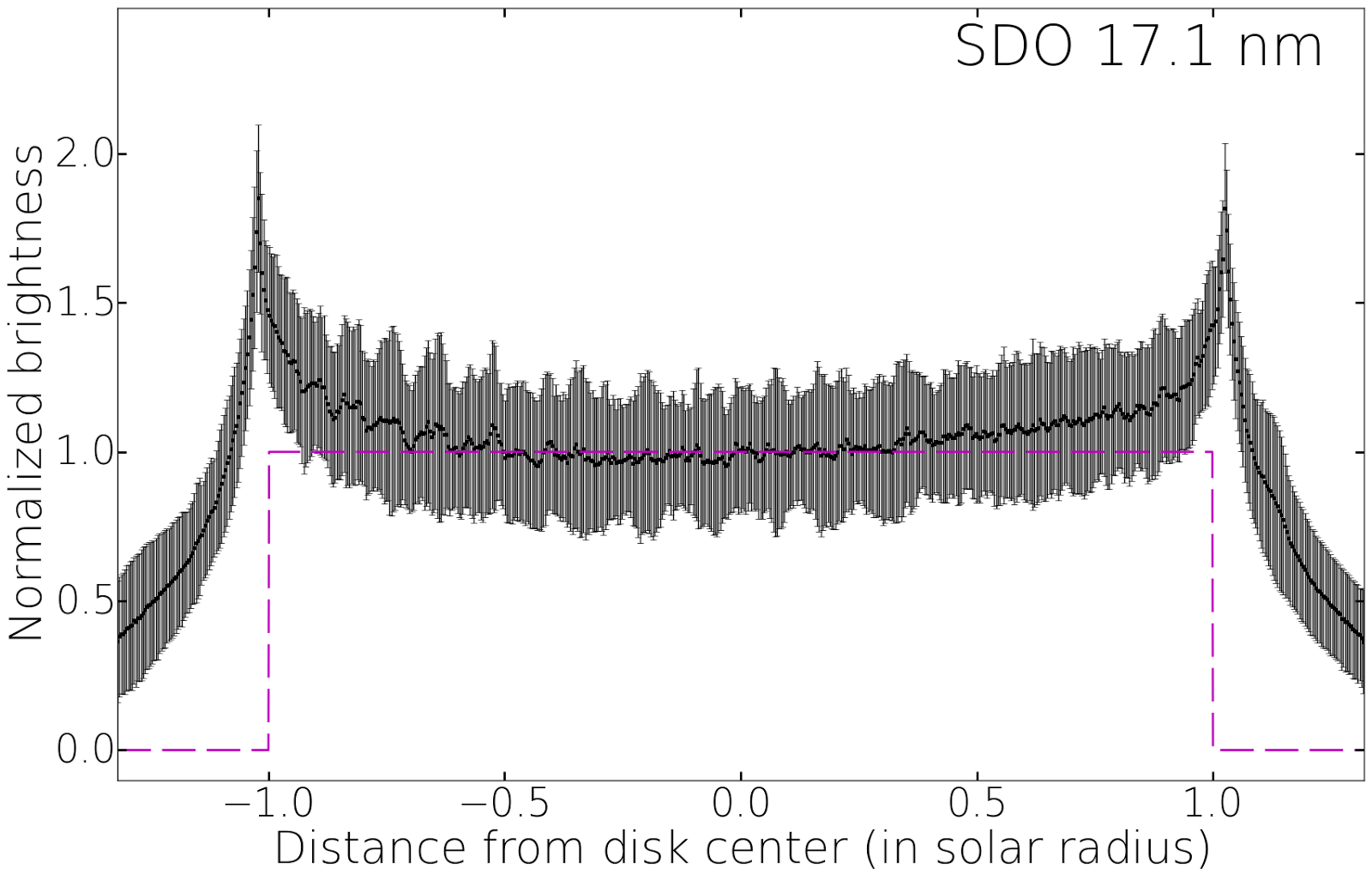
Finally, I come to the point where limb darkening actually is not 'darkening' anymore. I should rather say limb brightening here. In the figure you can see the brightness across the solar disk again normalized to the value at disk center. However, this time you see that the Sun is brighter on the edges than it is in the center.

I generated this plot from SDO images like the one on the left. They show the Sun in the extreme ultraviolet at a wavelength of 17.1 nm. At these short wavelengths the disk is very inhomogeneous and you see a lot of loop structures which show the magnetic field of the Sun. Like in the last blog on SDO 1600, this is not the photosphere we are seeing; it's not even really the chromosphere anymore, but more like layers above that. Here we start to see the corona of the Sun.

In this high-energetic wavelength regime the Sun has no sharp edge. The top panel shows how the brightness goes down after the peak at the edge, but it does not drop down to zero like in the other images I showed in previous posts. The bright loops extend far into outer layers of the Sun and you still get a significant amount of light from there.

Magnetic lines are connected to the activity of a star. The more active a star is, the more of these bright inhomogeneous structures it should have in its outer atmospheric layers. Like spots these structures rotate with the star and change all the time.

For wavelengths showing limb brightening, exoplanet transits would look very different for what we see in the visual or infrared. Transits can change significantly from one to the other because the magnetic structures change. Also, contrary to the visual wavelengths, the transits are deeper at the edges than in the center. However, transits at these short wavelengths (far-UV, EUV, or even X-rays) are very hard to detect.

Saturday, July 25, 2015

Limb darkening: SDO 160 nm


I wrote a lot about limb darkening in the previous posts and tried to carefully explain that the Sun gets darker when you go from the center of the disk to the limb. This effect is stronger for shorter wavelengths (ultraviolet) than for longer wavelengths (infrared). Guess what: Today I show you that this is not true.

Well, to understand that I have to explain that what I wrote about previously is correct for the photosphere of the star. I mentioned this in another blog already. If we talk about the photosphere, everything I wrote and showed before is correct. However, if I show you how the limb darkening of the Sun really looks like in an image, you will probably notice that the solar disk is brighter in the UV than in visual light.

Again I show a picture of the Solar Dynamics Observatory (SDO), however, this time not in the visual but in the ultraviolet (160 nm, see left image). Compared to the optical, the Sun has much more structure in this image.

In the top figure I present the brightness of the Sun in this wavelength from one edge to the other. To create this diagram, I used several dozen SDO images taken over a month, and averaged their brightnesses. Shown is the mean brightness and the error bars indicate how variable this brightness was in the course of one month. If you compare this graph to the one for the visual, you will notice that the limb darkening of the Sun is actually weaker in the UV. So comparing these two images you see the opposite of what I told you in the beginning and all the previous post on limb darkening.

The solution to this problem is: What you seen in this UV image of the Sun is not really the photosphere. You see a different part of the solar atmosphere which is slightly above the layer you see in the visual image of a previous post. You start seeing the chromosphere. And the chromosphere is different. There the Sun is hotter and a lot of light is emitted in shorter wavelengths. Because you see the emitting regions of the chromosphere better at the limb than in the center, you get more light from the limb. And the combination of all the light coming from different layers in the Sun in this UV wavelength interval makes up the figure I show in the top.

In this wavelength the brightness is still not higher in the limb than in the center, but in the next post I will show you a wavelength regime where we do not have limb darkening anymore - but limb brightening. With your naked eyes you will never see that because this is light you cannot receive with the human eye. So for us, the Sun has limb darkening.

I maybe should mention in the end, that the absolute brightness of the light coming from the chromosphere is much less than what you get from the photosphere. I always show normalized brightnesses, so this is something you cannot see in the figures. However, in absolute numbers there is much more light coming from the photosphere - which is basically the reason why we see it with the eye. But the relative contribution in the UV grows, which is the reason why we start detecting limb brightening for smaller wavelengths.