Thursday, July 30, 2015

Transits: Limb darkening - HD 209458 b in different colors (HST)

In the previous post I presented theoretical transits of how the exoplanet HD 209458 b should look like in different colors. Now I will show how its transits really look like.

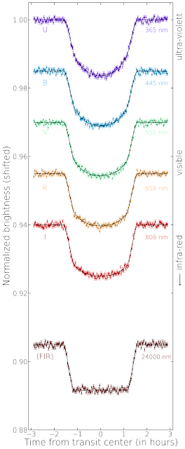
On the left you see observations of the Hubble Space Teleskope (HST) from 320 to 970 nm. The last transit, which is much nosier, is not from HST but Spitzer - a NASA space misson for infrared observations.

Actually, HST observed many spectra of the star covering a full transit. By averaging over different parts of the spectrum you get the transit in a certain color. The central wavelength of the interval over which was averaged is given on the right side of each transit. The colors range from the ultraviolet to the near-infrared.

The Spitzer data is special because it lies at a much higher wavelength in the far-infrared. There the star should have virtually no limb darkening anymore and the transit has a box shape. However, you cannot see that very well because it is much more difficult to get precise brightness measurements for these wavelengths. The star is much fainter there and, thus, the noise is much higher. Also the two instruments are pretty different which leads to non-equal measurement errors.

In the last post I showed what we should expect from theory - and the observations agree nicely with it. In UV and blue the shape of the transit is much rounder than for longer wavelength. Indeed, limb darkening is stronger for shorter wavelengths.

It is actually pretty hard to measure the limb darkening of stars; they are just too far away to spatially resolve them. Analyzing exoplanetary transits is one of the best methods to verify whether the theoretical predictions are really correct. And so far the models seem to work pretty well - although in detail observations and theory are not so easy to compare. After all, the exact shape of the transit depends on a lot of different things.

Wednesday, July 29, 2015

Transits: Limb darkening in theory

Now let us take a look at limb darkening in transits. In the beginning I will start with theoretical transits - transit lightcurves generated on the computer. This makes explanations a bit easier, we will come to real data soon enough.

For demonstration purposes I chose one of the best known exoplanets today: HD 209458 b. In 1999 this was the first transiting planet ever observed (Charbonneau 2000), a true milestone in the history of astrophysics. It is a huge planet, about 1.3 times the radius of Jupiter but only 70 % of its mass. It is a good planet to start with because its large size results in a deep transit.

The figure on the left side shows simulated transits of HD 209458 b for different wavelengths. This is interesting because the limb darkening of the star depends on the color you are looking at. So in different colors the transit shape will be different. I added a bit of noise to the lightcurve to make it look more like a real observation. The noise is roughly consistent with the uncertainty of the Hubble Space Telescope data of this planet I will show in the next post.

All transits are normalized meaning that the (average) brightness outside of the transit is one. However, if I plot them all over each other we would not see them very well anymore; so transits observed at longer wavelengths are shifted downwards. The corresponding wavelength (in nm) is given on the right side of each transit lightcurve. On the very right it is indicated to which wavelength regime (UV, visible, IR) this wavelength belongs. Keep in mind that visible light goes from 380 to 750 nm.

The x-axis shows you the time of the observation of each data point in hours from transit center; the transit duration of HD 209458 b is about three hours.

What can we learn from this figure? Due to the limb darkening the transit shape is round for blue colors (shorter wavelengths) and gets more box-shaped for red colors (longer wavelengths). When going further into the infrared, the transit looses its round shape completely because there is (almost) no limb darkening of the stellar disk anymore. In real data this would be nice because dealing with limb darkening can be a nuisance; you just have to deal with a few parameters less you do not really know for sure. However, it is not that easy to obtain high-quality transit lightcurves in the infrared - even for the best instruments scientist have right now. This is what I will show you in the next post.


Addendum: A more technical note at the end. On the left side of the transits in the figure letters are written: U, B, V, R, I (and FIR). These letters indicate the photometric bands (Johnson filters) used to simulate the transit lightcurves which are important to know the theoretically expected limb darkening. If you know your star and the photometric filter, you can calculate how the limb darkening should be. Here I use the non-parametric limb darkening coefficients for the Johnson filters for a Sun-like star published in this paper.
FIR is not a real filter; it stands for far-infrared. I just assumed at this long wavelength the limb darkening is zero. This way we have a comparison how the transit would look like if there is no limb darkening at all.

Limb darkening: SDO 17.1 nm


Finally, I come to the point where limb darkening actually is not 'darkening' anymore. I should rather say limb brightening here. In the figure you can see the brightness across the solar disk again normalized to the value at disk center. However, this time you see that the Sun is brighter on the edges than it is in the center.

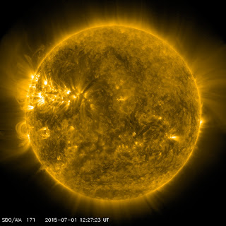
I generated this plot from SDO images like the one on the left. They show the Sun in the extreme ultraviolet at a wavelength of 17.1 nm. At these short wavelengths the disk is very inhomogeneous and you see a lot of loop structures which show the magnetic field of the Sun. Like in the last blog on SDO 1600, this is not the photosphere we are seeing; it's not even really the chromosphere anymore, but more like layers above that. Here we start to see the corona of the Sun.

In this high-energetic wavelength regime the Sun has no sharp edge. The top panel shows how the brightness goes down after the peak at the edge, but it does not drop down to zero like in the other images I showed in previous posts. The bright loops extend far into outer layers of the Sun and you still get a significant amount of light from there.

Magnetic lines are connected to the activity of a star. The more active a star is, the more of these bright inhomogeneous structures it should have in its outer atmospheric layers. Like spots these structures rotate with the star and change all the time.

For wavelengths showing limb brightening, exoplanet transits would look very different for what we see in the visual or infrared. Transits can change significantly from one to the other because the magnetic structures change. Also, contrary to the visual wavelengths, the transits are deeper at the edges than in the center. However, transits at these short wavelengths (far-UV, EUV, or even X-rays) are very hard to detect.

Saturday, July 25, 2015

Limb darkening: SDO 160 nm


I wrote a lot about limb darkening in the previous posts and tried to carefully explain that the Sun gets darker when you go from the center of the disk to the limb. This effect is stronger for shorter wavelengths (ultraviolet) than for longer wavelengths (infrared). Guess what: Today I show you that this is not true.

Well, to understand that I have to explain that what I wrote about previously is correct for the photosphere of the star. I mentioned this in another blog already. If we talk about the photosphere, everything I wrote and showed before is correct. However, if I show you how the limb darkening of the Sun really looks like in an image, you will probably notice that the solar disk is brighter in the UV than in visual light.

Again I show a picture of the Solar Dynamics Observatory (SDO), however, this time not in the visual but in the ultraviolet (160 nm, see left image). Compared to the optical, the Sun has much more structure in this image.

In the top figure I present the brightness of the Sun in this wavelength from one edge to the other. To create this diagram, I used several dozen SDO images taken over a month, and averaged their brightnesses. Shown is the mean brightness and the error bars indicate how variable this brightness was in the course of one month. If you compare this graph to the one for the visual, you will notice that the limb darkening of the Sun is actually weaker in the UV. So comparing these two images you see the opposite of what I told you in the beginning and all the previous post on limb darkening.

The solution to this problem is: What you seen in this UV image of the Sun is not really the photosphere. You see a different part of the solar atmosphere which is slightly above the layer you see in the visual image of a previous post. You start seeing the chromosphere. And the chromosphere is different. There the Sun is hotter and a lot of light is emitted in shorter wavelengths. Because you see the emitting regions of the chromosphere better at the limb than in the center, you get more light from the limb. And the combination of all the light coming from different layers in the Sun in this UV wavelength interval makes up the figure I show in the top.

In this wavelength the brightness is still not higher in the limb than in the center, but in the next post I will show you a wavelength regime where we do not have limb darkening anymore - but limb brightening. With your naked eyes you will never see that because this is light you cannot receive with the human eye. So for us, the Sun has limb darkening.

I maybe should mention in the end, that the absolute brightness of the light coming from the chromosphere is much less than what you get from the photosphere. I always show normalized brightnesses, so this is something you cannot see in the figures. However, in absolute numbers there is much more light coming from the photosphere - which is basically the reason why we see it with the eye. But the relative contribution in the UV grows, which is the reason why we start detecting limb brightening for smaller wavelengths.

Friday, July 24, 2015

Limb darkening in a single spectral line


If we take a look at a very small wavelength interval of the spectrum of a star - a single spectral line - limb darkening is quite different again. For this example I chose the Hα line, a spectral line of the hydrogen atom and a prominent line in many stellar spectra. In the lower panel of the figure you can see how the line, which is in absorption here, looks like. Its rest wavelength (in vacuum) is at 656.46 nm, which corresponds to a red color in the visible wavelength range. This is why, if we look at the Sun through a telescope with an Hα filter, the solar disk is red.
 
The continuum left and right to the line is normalized to one. This way it is easy to see that the center of the line is more than 40 % less bright than the continuum. What I show here are not observations but I use theoretical models of spectra - a computational calculation of how the spectrum of a certain star should look like. I used PHOENIX spectra of a Sun-like star, which are pretty close to what we observe in nature. Actually, I think it is really amazing that people can calculate a star in a computer.

What I'd like to show in this diagram is that if you go in small wavelengths steps from one side of the line to the other, the limb darkening changes a lot. The color code now is from the left side of the line (blue) to the right side of the line (red); each point of the line corresponds to the line with the same color in the upper panel. You can see that the violet/blue and the red lines, which are coming from outside the spectral line, show the limb darkening we saw in previous posts for the visual wavelength regime (large interval). Now if you go inside the line you see that the limb darkening dramatically decreases, meaning that the brightness on the limb goes up. It goes even further up then in the case of infra-red wavelengths. At the bottom of the Hα line the limb darkening is very weak; in the Hα core the solar disk looks much more uniformly bright than we see it with the eye.

This behavior is true for many spectral lines but not for all. Depending on where the spectral line is created in the atmosphere of the star, the spectral line might even get darker to the limb. The point is: Different parts of a spectral line can have very different limb 'darkening'. And what we usually see as limb darkening is the continuum case, which is the average over a large interval of the spectrum (and over many spectral lines).


Thursday, July 23, 2015

Limb darkening with color


It is important to understand that limb darkening depends on the color - the wavelength - you are looking at. So if you look at the Sun in the blue or in the red color, the limb darkening is different. This is what I would like to illustrate here. The x-axis shows the position on the disk, with zero being in the center and one being at the edge. The y-axis shows the brightness of the star divided by the value in the center.

The diagram visualizes how limb darkening looks like for the continuum, which basically means averaged over a large wavelength interval which in this case is in the visual wavelength regime. The colors indicate the central wavelength of the used interval, each interval is 10 nm wide. So the  380 nm line (blue) shows how limb darkening looks like on average over the wavelengths from 375 to 385 nm.

The bottom line is: For all colors a star is brighter at the center than at the edge. But for longer wavelengths (red colors) the limb darkening is weaker than for short wavelengths (blue); the difference in brightness between center and limb is smaller for longer than for shorter wavelengths.

For comparison I also draw one line in the ultraviolet (100 nm) and one in the infrared (2500 nm). In these cases, which are imperceptible by the eye, limb darkening really looks very different. In the IR the disk is only 20 % darker at the edges than in the center, whereas for UV the limb of the star is virtually dark.

Especially interesting is the fact that the radius of the star is not equal for all colors. Where the distance from the disk center equals one the stellar disk is supposed to end and the brightness should be zero. However, this is not true. In the UV the brightness is still non-zero well beyond the 'defined' edge of the star. Zooming into that region we would see that this is true for all colors - in each color the star has a slightly different 'size'. Although this might seem to be weird when thinking about it the first time, it actually is not very surprising. What we call the edge or surface of the Sun is not a real boundary, the Sun does not suddenly stop within a meter or even a kilometer. What we see as surface of the Sun is the region in the atmosphere where the visible light is coming from - the photosphere - which is several hundreds of kilometer thick. Above that layer comes the chromosphere, and above that the corona. So the Sun, and other stars too, does not have a sharp edge. This, maybe, makes it easier to understand why in the diagram the Sun does not have the same radius for all colors.

Tuesday, July 21, 2015

Solar limb darkening


In my previous post on the transit method I briefly mentioned limb darkening. I did not want to discuss it there and just ignored it, but I would like to come back to it now because it is an important effect - especially for transits. In this post I will talk about what limb darkening is, its relevance for transits I will discuss in another post.

To the left you see an image of the Sun (July 20, 2015) taken by the Solar Dynamics Observatory (SDO), a NASA mission constantly observing the Sun. As you might notice the disk of the sun is not uniformly bright. The Sun is brighter in the center than it is on the edges. This is commonly referred to as limb darkening. The physical reason for this is that the Sun gets hotter the further you go down to the core. So if you look at material at the surface it is colder than material deeper in the Sun. In the center of the disk you see down to hotter material than at the edges, and hotter material emits more light.
I think the sketch on the wikipedia page is pretty informative, so I do not bother to create a new one. It illustrates nicely that the length L you look through the stellar atmosphere is equal in the center and the limb of the star; however, you do not look down to material of the same temperature. And because in the disk center the material you see is hotter, this part of the Sun is brighter, too.

Now I finally come to my diagram in the beginning of this blog. It shows the brightness of the solar disk from one limb to the other. I determined this from SDO images (July 20, 2015) averaging several pictures stretching over almost five hours. The brightness is normalized to one, meaning that I just divided it by the brightness in the center of the disk. You can see the steep rise in brightness on the left limb of the disk, the maximum in the center, and the decline to the right edge. I averaged over about dozen images and the one-sigma error bars indicate how much the solar surface brightness has varied in these roughly five hours. For most points this is a change of at least several percent, so the solar surface brightness is varying all the time on a small scale.

That the disk is not really uniformly bright can be seen especially well in starspots. You can see a few in the SDO image. However, you can also see brighter regions, e.g., on the right side of the top diagram. I zoomed in to the region where a bump is visible. Here a small part of the disk is brighter than the surrounding area, and it is also quite variable because the error bars are large. We also should not forget that the Sun is rotating and features on its surface are slowly moving to the right; although this effect is very small during a couple of hours, it might contribute to the variability.

There is much more to talk about concerning this topic, but I will close for now with this: If the Sun would not have limb darkening, its brightness distribution from one limb to the other would look like the dashed magenta line in the diagram: full brightness everywhere. Not having a uniformly bright disk has severe effects on exoplanetary transits because the shape of the transit depends on how exactly the distribution looks like. I will talk about that in one of the upcoming post.

Sunday, July 19, 2015

The transit method


The transit method is one of the most important techniques to detect and to study extrasolar planets. Using this method, up to date 1210 exoplanets have been found (exoplanet.eu), the majority by the unbelievably successful NASA Kepler mission, but also by the European mission CoRoT and many ground-based programs.

Planets orbiting their host star can, if we look at the system from a favorable viewing angle, pass in front of the stellar disk. For most systems we will never see planetary transits because the orbits do not have the right inclination. But if we look at thousands of stars we will have - by chance - some planets moving between their host stars and us. When this happens, part of the star's light is blocked by the exoplanet and does not reach the Earth anymore.

The upper part of the diagram explains this in detail. The large yellow circle is the disk of the star and the small blue circle is the planet orbiting around it. From our point of view the orbit is only tilted a little bit, so when the planet orbits around its host star it will cross the stellar disk (although not directly in the center). If the plane of the orbit was tilted a little bit more, the planet would transit the star closer to the edge; if the tilt is large enough, it would not transit at all.

The lower part of the diagram shows the lightcurve, which is the measured brightness with time, of the system as it would be observed from our point of view. It is important to understand that for most systems we cannot resolve the star and the planet, which means we measure the brightness of both - star and planet. We cannot take a picture of the system as I plotted it; even in an image of the best telescopes we have, the system would always look like a point. Most systems are so far away that we have not yet the technology to separate planet and star.

For simplicity I assume here that the planet itself emits no light at all. In reality, this is not true, but for many systems the contribution of the planet is so small that you cannot see it.

In the diagram the same planet is plotted four times at different positions of its way around the star. In the lightcurve these four positions are indicated on the time axis. I will explain these four situations in detail:

  1. The planet is not yet on the stellar disk. In the lightcurve the brightness of the system is at 100 % because all of the light coming from the star can be see.
  2. The planet just moved onto the stellar disk. During the time period when the planetary disk moves on the stellar disk, but is not yet complete on it, the brightness goes down steeply. This is the beginning of the transit, which is also called ingress.
  3. Now the planet is completely on the stellar disk and the brightness dropped down to a lower level. As long as the entire disk of the planet is on the star, the brightness stays down there. This flat bottom is again a simplification; in reality, the brightness will change, even during the transit, because the stellar disk is not equally bright in all parts. In particular, it is darker at the edges than in the center, which is referred to as limb-darkening. However, I will ignore this effect here. Important is that the brightness goes down to a constant value of 0.99, so the light we receive from the system is 1 % less than when there is no transit. It is easy to understand where this comes from: The planetary disk blocks 1 % of the stellar disk, so 1 % of the light cannot reach us anymore. You now know the size of the planet relative to the star. The relative disk size is 1 %, the relative radius is the square-root of ita: 10 %. In our example the radius of the planet is 10 % the radius of the star. This is the beauty of the transit method: Just by measuring the depth of the transit, which can be easily done by anybody, we know the radius of the planet.
  4. The planet moved on its orbit to the other side of the star. When it moved off the disk, which is called egress, the lightcurve went up steeply back to the 100 % brightness it had before the transit. Now the planet moves around the star and will in a certain period of time, depending on its orbital period, come back for another transit.
Like every other technique the transit method has strong and weak points. On the plus side: It is a conceptually easy method and requires only to measure brightnesses of many stars. From the lightcurve you easily get two important, fundamental properties of the planet: its radius relative to the star and its orbital period, which is how long the planet takes to move once entirely around the star. From this you can already learn quite a lot about the planet. However, on the down side: The probability to see a transit is low; even worse, it depends on the planet's distance from its host star. I will certainly talk about this in a separate post, but it means that far out planets are very hard to detect. One might also considered it as a weak point that it is not possible to measure a planet's mass from its transit - at least not in every case and in a simple manner. Since the mass is a very fundamental property, one has to get the mass somehow, which usually is by using the radial velocity (RV) technique.

In the end I would like to mention that until about a year ago it was not considered to be good practice to announce a new planet just because transits in a lightcurve were found. There are some other problems I did not mention here, which make it possible that the "transits" you observe do not really come from a planet. So one always had to check the system with the RV technique; only if the planet was found there, too, it was accepted as a real exoplanet. However, this has changed lately and you do not always have to backup a transit detection anymore. Although this might be based on good reasons, some astrophysicists are not very happy with it - maybe I will talk about this controversy in some other post.

a. Simple geometry: The area A of a circular disk is πR2. If you have the area ratio and want the radius ratio you have to square-root the first to get the latter.

Saturday, July 18, 2015

Multi-planet systems with at least 3 (exoplanet.eu)

This plot shows the 156 exoplanet systems with at least three planets known to date according to exoplanet.eu. Additionally, the solar system is drawn at the very beginning. The x-axis gives the distance of the planet to its host star (in Astronomical Units); note that it is a logarithmic scale, so planets a little bit further to the right are actually much further away from the star. The thick green line illustrates the distance of the Earth from the Sun. To the left of each system its name is given.

The orange circles at a distance of (almost) zero illustrate the size of the star relative to the Sun, so it's the star's radius compared to the Sun's radius, which is shown at the upper left. All the other circles (green, yellow, pink) to the right of the orange stars indicate the planets, and their sizes are not in proportion to the stellar sizes. The relative planet sizes are only correct when comparing planets but not in relation to the stars. The scale of the planets was arbitrarily chosen so that the large planets are not too big and the small planets are still visible.

Now we have again the complication that planets are detected using different methods. Some of these systems were found with the transit method, others were detected with the RV technique. For the latter we usually only have the masses but not the radii; these systems are colored pink and the circle sizes correspond to the masses. The other systems have known radii derived from transits and they have yellow colors. To be able to roughly compare masses and radii with each other, I again assume a density: I define that all planets with one Jupiter radius must have the mass of Jupiter. Although this probably makes good sense for large planets, it most likely is pretty wrong in the case of small (rocky) planets. One should keep this is mind when comparing pink and yellow circles.

On the right side of the panel the number of planets in the system is given. The solar system is still the one with the most planets known but this will certainly change in the near future. Right below it you can already see one system with seven and four systems with six planets.

I do not want to go into detail on individual systems here, but rather give some general remarks:

The fact that most RV systems have huge planets compared to the transiting ones is not rooted in the way I present it; the RV technique is not yet capable of measuring the masses of the smaller planets detected with transits. You can also see that in my post on detection methods.

Most exoplanets are closer to the star than the solar planets; exoplanets with orbital periods of years and decades, which would be far out in a system, are very tough to detect.

Finally, the smallest planets usually orbit stars smaller than the sun. This again is caused by the transit and RV method, which depend of the relative sizes or masses of host star and planet. Thus, the conclusion that less massive stars have less massive planets is tricky because for the more massive stars they are much harder to find.

In upcoming posts I will present diagrams of - and talk in detail about - several systems shown here individually. As you might already suspect, all of these systems are highly interesting.

(Link to a hi-res pdf version of this diagram.)

Addendum: In this diagram I only considered planets from transits or RVs. This is why HR 8799 (direct imaging) and PSR 1257 12 (timing) are not included. Unfortunately, for quite a number of shown systems planets are missing; this is due to the exoplanet.eu database not providing the semi-major axis (distance) of these planets.

Friday, July 17, 2015

Exoplanets by detection method (exoplanet.eu)


This figure shows a total of 1932 planets with masses (in Jupiter mass) over distance of the planet to its host star (semi-major axis in Astronomical Units). Different marker symbols (with different colors) stand for the method used to detect the planet. The data is taken from exoplanet.eu.

The transit method cannot derive the planetary mass. This is why I have two different categories for transits: a regular one (black circles) and  'Transit R' (yellow circles). The first category has masses measured with a different technique, usually the radial velocity method. The 'R' category, which are virtually all the small transiting planets, do not have their masses measured yet. So how do I know it then? I know the radius from the transit method and assume a density. So the masses of the yellow circles are probably incorrect to some degree; however, it gives me a rough estimate where they might lie and I can plot all planets in this graph.

One could probably give an entire lecture just on this one picture. I will only give some brief notes.
  • Using different symbols illustrates nicely which types of planets are discovered by which method. E.g., the transit method is good in finding planets close to the star down to very small sizes. However, it works bad for long period planets.
  • The very far out planets are all detected by direct imaging. However, they are also huge which might in many cases not really qualify them as something we would call a planet - they are just too massive and more like a thing between a planet and a star. Strangely, two close-in planets are marked as directly imaged, too. This is incorrect and caused by an error in the database. These points indicate Kepler-70 b and c which are not imaged planets. Actually, they were not even seen in transits and are, in my opinion, highly disputable.
  • The smallest planet is Kepler-37 b which only is about 30 % the radius of the Earth. This means it is smaller than Mercury.
  • The solar system planets do not really look like they are a part of the distribution but are located to the lower edge of the exoplanet distribution. However, it is exciting that we slowly start to see exoplanets with roughly the same size and distance than Earth. I think it cannot be emphasized enough that this information alone does not tell us much about whether the conditions on these planets are comparable to Earth at all.
  • In the end I should probably point out that the most important method to determine the masses of exoplanets is the radial velocity technique (RV). You can see that it covers a large range of masses and distances. Although its results are extremely important, we should not forget that it does not give us the exact mass of the planet. The result still depends on how well we can determine the mass of the star and, which is the bigger challenge, what the inclination of the planet's orbit around the star is. The latter is in most of the cases completely unknown.